*Originally posted to LinkedIn April 2026*
As a historian, it’s my job to think about what story the evidence tells us: who is doing what, and why. I approach current alcohol research in much the same way.
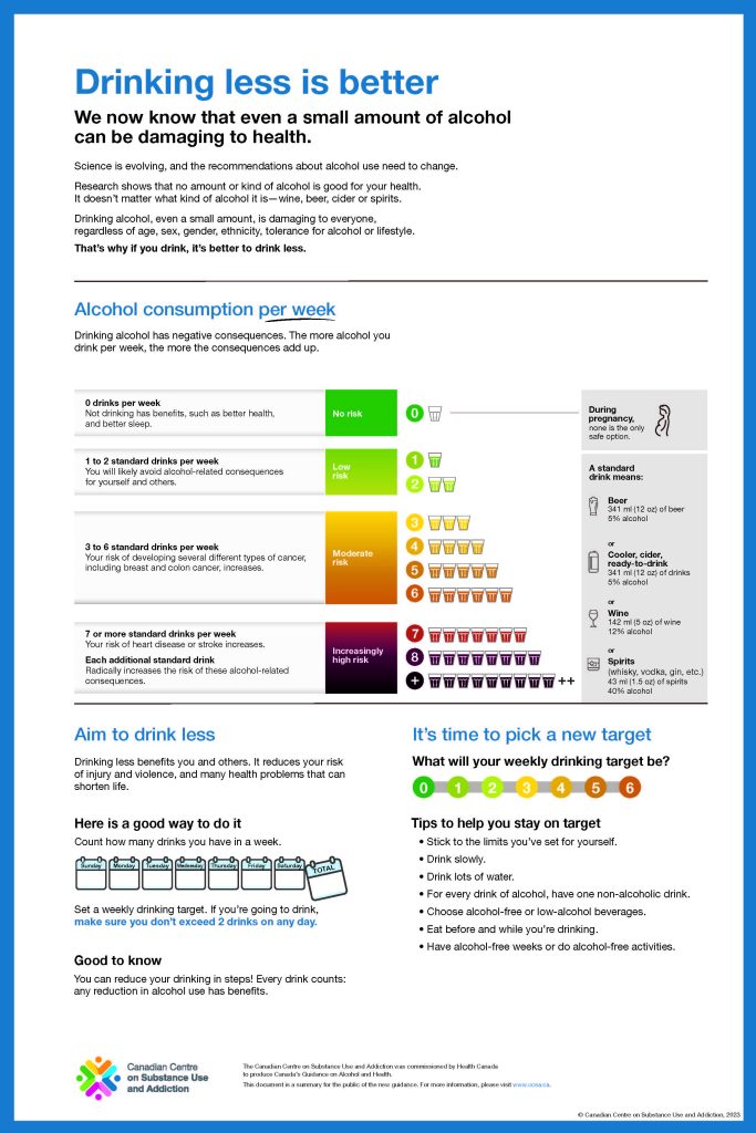
Consider, for example, the CCSA’s low risk alcohol guidance. We see a narrative designed to lead readers in a specific direction. It’s a familiar structure:
–Alcohol (and by extension the alcohol industry) is the villain, the agent of harm.
–People who drink are the unwitting victims.
–Researchers, working with population-level datasets and increasingly sophisticated analytical tools, identify the problem.
From here the story can move in several directions:
–Policymakers, now equipped with this evidence, are expected to address the threat.
–Drinkers, now informed by science, are expected to change their behaviour.
(Often, both are expected)
This format can affect the type of evidence presented and highlighted. Decisions about which effects to emphasize (such as mildly increased risk of cancer versus decreased risk of heart disease), how to group categories, or how to illustrate results aren’t just technical decisions: they help hold the story together.
When this is combined with a narrowed field of vision—where certain kinds of evidence or perspectives are set aside—the story begins to move in a particular direction.
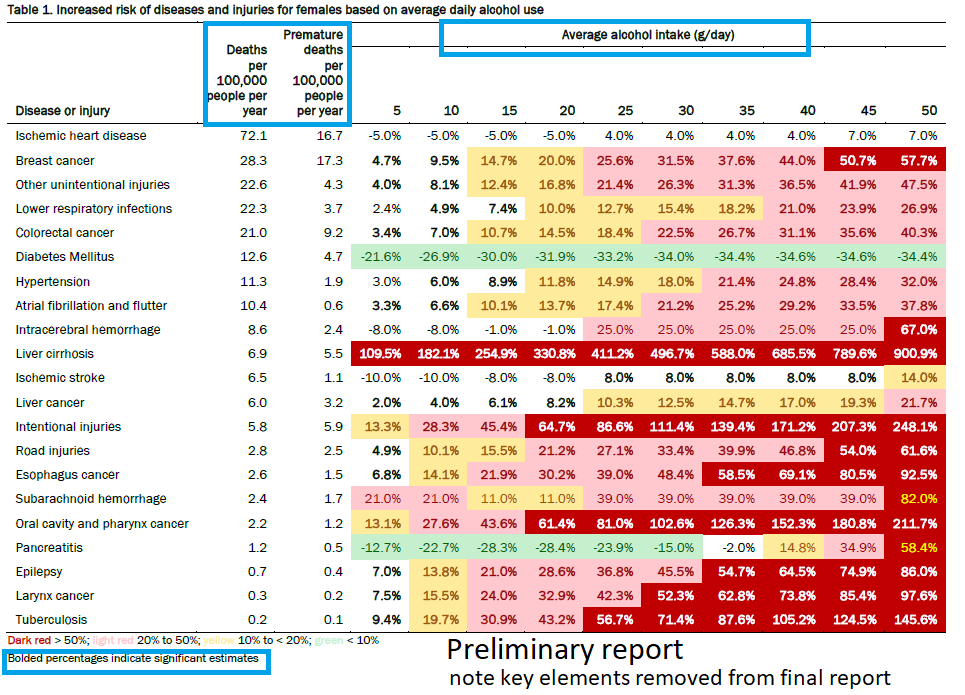
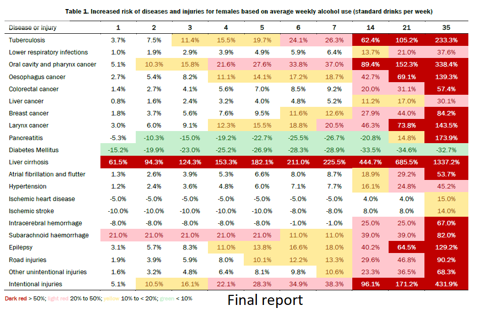
This may be illustrated by the difference between the risk table in the CCSA’s preliminary report (Aug 2022) and the final guidance (Jan 2023). (I’ve attached examples below and the colour coding itself is telling.)
We are no longer just looking at data. We are looking at data being organized into a particular kind of narrative that points toward a single, consistent conclusion.
I have highlighted the way the data presentation has changed. The death rates have disappeared, which were really the only way a reader could get a sense of absolute risk. The alcohol intake data has changed (in the preliminary report it was grams per day, but the final report was drinks per week–which is better since peple tend not to think of drinking in terms of grams of alcohol).
The little notation that bolded data indicates “significant estimates” is now gone. That change may be useful because what does “significant estimate” mean, Does “significant” mean “major” or “big” or does it mean statistically significant–the latter actually. Also what does “estimate” mean in terms of how that informs the final guidance.
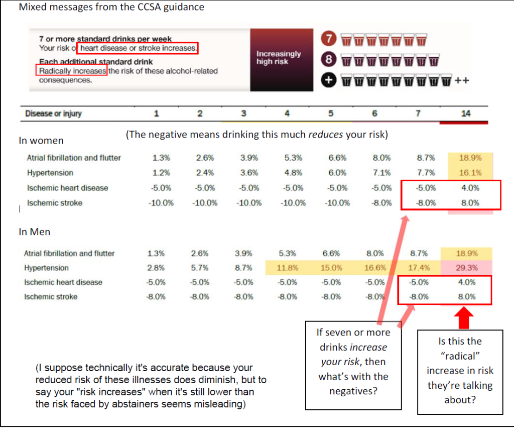
Also notable is that the final data table indicates drinks up to 7 drinks per week then jumps to 14. It does not show 8-13 drinks even though the advice does specifically talk about what happens at 7 drinks or more. See the final two images.
Leave a Reply