Category: Uncategorized

  • Representing risk in different ways: Number Needed to Harm

    As I argued in an earlier post, the Canadian Centre on Substance Use and Addiction’s 2023 “Low Risk Drinking Guidance” used a Years of Life Lost (YLL) calculation to determine what is a low, moderate, and high risk, but YLL makes no sense for individual risk calculation.

    Moreover, saying “more than two drinks per week is increasingly risky” gives no sense of how risky and what it means both to an individual and to policy makers.

    When discussing this fuzzy idea of risk as a public health communication problem, some colleagues in our public health program wondered why these researchers were not using NNT: “Number Needed to Treat.”

    NNT is a calculation of how many interventions need to be done for one person’s outcome to change. How many people need to be treated for X condition for one person to be healed? (For more, read this.)

    If an intervention treats effectively every person who receives it, the NNT is 1:1. If an intervention is effective for 1 in every 100 people, its 1:100.

    A related concept, is Number Needed to Harm (NNH). For explanation see this Wikipedia entry. For details on how to calculate it, check this site.

    NNH is the number of people who need to do something for a bad outcome to happen to one person. How many people need to drive their car for one person to have an accident? (by the way NNH for car driving is much higher than for motorcycles which is why my mom would be very sad if I took up riding but some people might encourage it…)

    Number Needed to Treat/Harm can be a more evocative way of understanding the necessity or power of a health intervention. If an intervention has an NNT of 1:1, the treatment should probably be recommended in clinical guidelines.

    But if only one person is healed for every 10,000 people taking that drug or doing the intervention (NNT 1:10,000 ) the argument for this intervention being endorsed as a general health policy would not be as strong.

    Similarly, NNH of 1:1 would mean iceberg dead ahead! (although such an NNH is highly unlikely for most things we do as a normal part of life).

    Something like 1: 10,000 might mean “the only ice I’m likely to see is in my G&T.”

    How does NNH inform our understanding of alcohol risk? I’ll let you be the judge.

    We can calculate a type of NNH from the CCSA’s own data.

    In the CCSA’s preliminary report, released in August 2022 “for public consultation” they provide a calculation of annual death rates per condition, calculating it as the rate if people did not drink. Then the relative risk data they provide is intended to give a sense of how much more or less likely it is to die from that condition, based on how much you drink per day.

    Using this data for NNH is relatively easy–although for transparency I will note that I was assisted by Claude.ai. Claude did the calculations–I verified Claude’s formula on the metricgate site listed above. (And to be clear, I wrote this post myself. Claude just did some of the bulk math and yes I use EM dashes a lot in my everyday writing).

    The formula is pretty straightforward: Baseline death rate (here at deaths per 100,000 per year) multiplied by the relative risk gives us the increase in number of deaths per year when drinking is added to the annual death rate.

    So for example, if the deaths per 100,000 is 10, and the increased risk when drinking say 30g of alcohol per day is 5%, then the number who would be expected to die is 10.5 (5% increase of 10). That is applying relative risk as a percentage to absolute risk as a ratio (10 in 100,000).

    The increase from drinking is the difference between those two numbers. So 10.5/100,000-10/100,000=0.5/100,000 or 0.000005. This is called the “Absolute Risk Increase/Decrease” or ARI.

    The NNH is the inverse of the ARI, so 1 divided by ARI.

    So the number needed to harm in this example is 1/0.000005 or 200,000.

    So for every 200,000 people drinking 30g a day, one additional person will die from it each year.

    Note: the normal way of calculating NNH is to use absolute risk (you have an X in Y chance of dying from Z condition om your lifetime). But since the CCSA provides a baseline risk in annual deaths and a relative risk as amount consumed increases, we can calculate only a per year NNH.

    It is not as powerful as a lifetime risk calculation, but it does provide some pretty interesting results. And lifetime risk calculations have the same problems anyway, since risks change over the lifespan.

    Below are the calculations for each condition listed at 15 and 30 grams/day, which is just over 1 and just over 2 standard drinks (in Canada a standard drink is 13.45g).

    I also calculated the rates based on the premature death rate the CCSA gives for each condition. I am of two minds on this. On the one hand, since it seems people would be most worried about the risk of premature death from a condition, it would seem appropriate to use the premature death rate for NNH. My reasoning is, since we all have to die of something, the only real concern should be the risk of premature death.

    However, one could also argue that the full death rate gives a better indication of the risk of dying from something.

    In the end neither is really satisfying. We face different risks at different times of our lives, but, I’ve said many times, we all die of something.

    The data is available at the CCSA website if you want to do the calculations for other amounts.

    Beneath these tables are some of my observations.

    Deaths per year for women–annual death rate
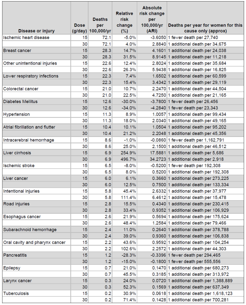
    Premature deaths per year for women
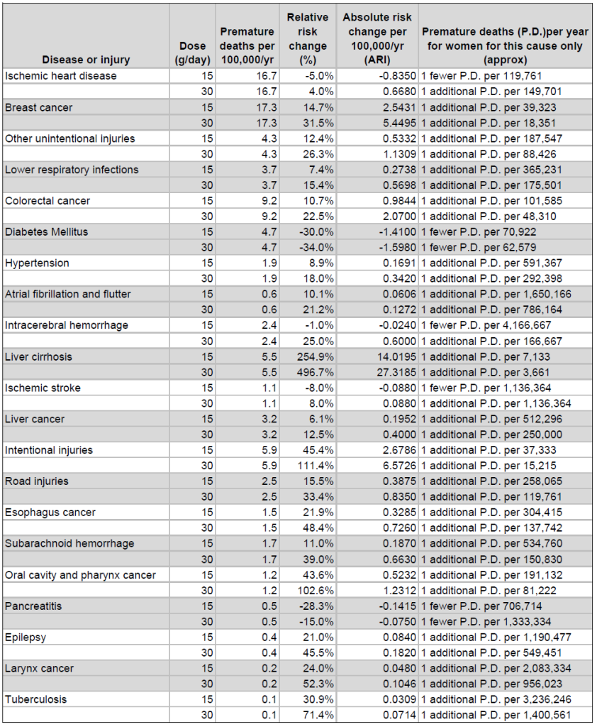
    Deaths per year for men
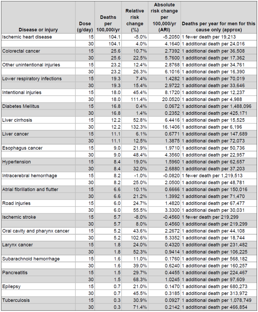
    Premature deaths per year for men
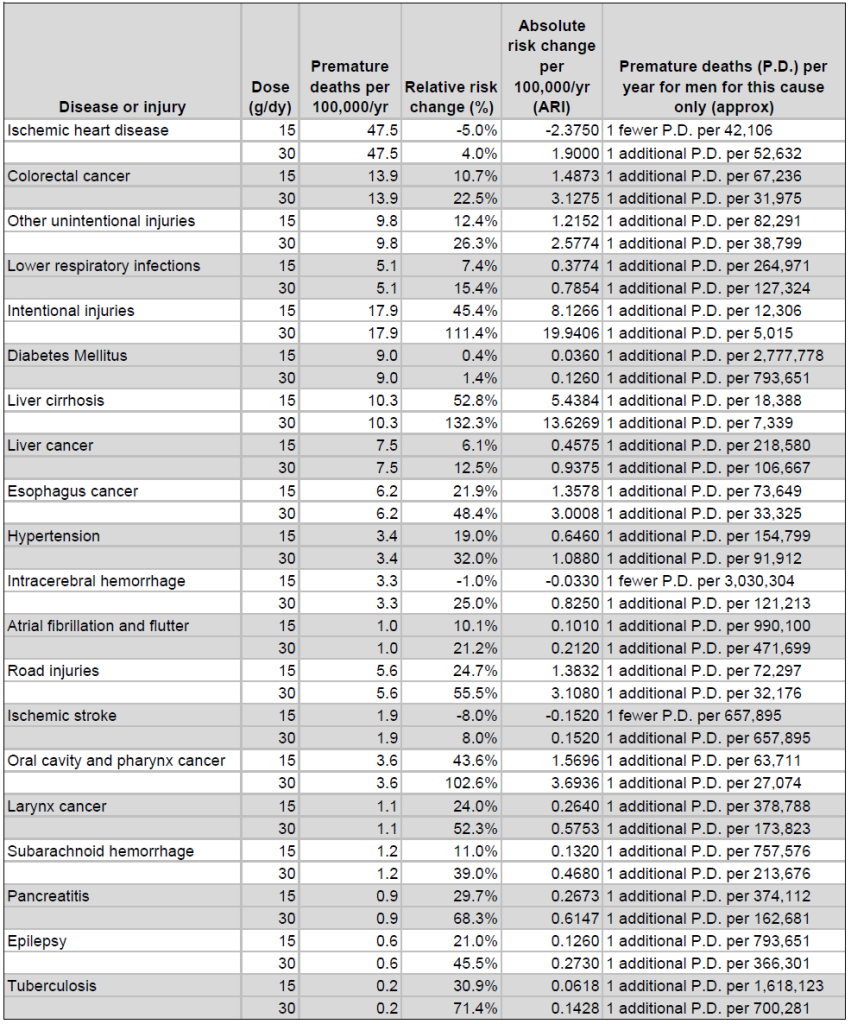
    How to interpret these tables:

    Look at the last column. That shows you how many people need to drink that much for one additional death to occur each year.

    For example, consider ischemic stroke: for every 219,299 men drinking about one drink a day, there will be 1 fewer deaths from ischemic stroke, but for every 219,299 men drinking about 2 drinks a day, there will be 1 additional death.

    But look at women’s data for liver cirrhosis. At 30g/day it’s 1:2918. (Now ask how this could be the case. One additional liver cirrhosis death per 3000-ish people? I’ll come back to that)

    So there are a bunch of caveats, things you need to consider when reading this data.

    As I have said numerous times, population level data is not really easy to apply to individual experience. So the relative risks we are using may not apply to an individual’s own case.

    On top of that, this data implies that the risk remains the same throughout a lifetime. That does not capture the wide variation of health benefits and risks we encounter in our lives. (see my post comparing the 2011 and 2023 Canadian low risk guidance, and how the 2011 Guidelines considered lives as more complex than the 2023 Guidance.)

    Risks change: Young men have higher risk of car accidents; someone who smokes has a higher risk of esophageal cancer; propensity to self harm is not uniform across the population; we drink different amounts at different times of our lives and even at different times of the year.

    Everyone faces different risk factors and that is entirely missing from current guidance and discourse on alcohol. See my post on “Culture Scrubbing” and the social determinants of health for more on that.

    An additional caveat is a problem with saying low levels of drinking lead to harms from excess. For example, it’s really doubtful that someone will die of liver cirrhosis because they drank 2 drinks per day for their entire life. I wrote about this problem a while ago.

    In fact that data for liver cirrhosis belies the entire problem with the CCSA’s calculations. If it is the case that for every 2918 women drinking 30g there will be one who develops liver cirrhosis, then we would have an epidemic of liver cirrhosis in women drinking moderate amounts of alcohol, such as slightly higher than in previous guidelines.

    But the reason we don’t have women dropping dead of cirrhosis all over the place is because cirrhosis kills mostly people who have been drinking sustained high levels of alcohol (unless their liver is effed-up by things like Hepatitis C). So the 500% increase at 30g is math distorting reality.

    Final thoughts

    NNH is a different way of representing impact of drinking and puts risk in a different light. By using the same data the CCSA uses, but not making broad conclusions about how much is too much, I’m providing a different way to understand the risk using the same data. And this info is designed to inform, but not frighten or lead you towards one catastrophic conclusion.

    I hope this is helpful. But even if not, the use of NNH shows again the weakness of the CCSA guidance as an assessment of risk. But at least NNH shows that the idea of risk can be represented in a less worrisome way.

    Drink or don’t drink, it’s your choice. If it makes you happy, brings you together with friends, helps you relax, is part of a meaningful ritual in your life, have at ‘er. Of course be careful and seek help if you feel your drinking is becoming a problem.

    Just don’t be frightened into behaviour change because some career anti-alcohol researchers are pushing out scary data.

    ===

    Other caveats

    Epidemiologists will read this and want to know the confidence interval for each calculation. So would I. However, since the CCSA does not provide it consistently, I cannot either. There is some indication of the power of a calculation in the preliminary data (Aug 2022) when they highlight what they call “significant estimates” but that is not something I think worth going into here.

    There are other conditions related to drinking that do not end in death. Some are bad, and some are good. There are also benefits to drinking. Neither of these is captured in the data I have presented.

    A better way of getting a sense of absolute risk is to give lifetime risk. This however, is really difficult to get for all these conditions. And usually the lifetime risk info we get is risk of contracting an illness, not dying from it. So there is that complication.

    *This post was edited on 14 September because the original formula in my example was incorrect.
  • How results can be massaged to reiterate harm

    (posted on LinkedIn 28 Aug 2026)

    If you’re interested in 1) research on cancer and alcohol and 2) an example of how researchers tend to skew their results to emphasize harms, go no further than a recent article in the Journal of General Internal Medicine, published May 2026 (Pinheiro et al “Reevaluating the Alcohol-Cancer Link:L Long-Term Cancer Mortality outcomes in the REGARDS study”).

    This analyzes data in a longitudinal study of people enrolled in the research cohort in the early 2000s. I’m not going into the details, what fascinates me is the difference between the conclusions and the results. (I learned of this study when someone sent me an overview published in Wine Spectator 30 Sept 2026. Thanks to him who shall remain unnamed here).

    The conclusions at first seem pretty dire and linked to clinical guidance:

    Our findings contribute to the growing evidence that heavy alcohol use is consistently linked with higher cancer mortality. We encourage cancer prevention strategies to step away from isolating single health behaviors and consider holistic perspectives of an individual’s lifestyle including physical activity, smoking, diet, and alcohol consumption.

    Nothing surprising here eh?

    But consider the Results of the study [I emphasize a few items] which don’t seem entirely in step with the conclusions:

    Among 26,694 participants, mean age was 64.4 (SD 9.4) years, 44% were male, 42% were Non-Hispanic Black, 63% reported no alcohol, 22% light, 11% moderate, and 4% heavy alcohol consumption. Over a median 13.3-year follow-up, we observed 2306 cancer deaths. After full adjustment for covariates, compared to abstainers, heavy drinkers had an increased risk of cancer death (1.21; 95% CI 1.01–1.45), and light drinkers had a decreased risk of cancer mortality (0.87; 95% CI 0.78–0.98), and there was no association between moderate drinking and cancer mortality.

    That is a very different downstream outcome than results from a focus on cancer and heavy drinking.

    light drinkers had a decreased risk of cancer mortality… and there was no association between moderate drinking and cancer mortality.”

    Pinheiro et al 2026

    Given that this is a longitudinal study directly looking at outcomes rather than using population level data, it’s meaningful… and powerful… but we often see with alcohol harm research, the researchers focus on the harm rather than the counter narrative of the light and moderate drinkers (which btw were also a larger proportion of their cohort).

    It’s open access, so read it here: https://link.springer.com/article/10.1007/s11606-026-10479-3

    Reference

    Pinheiro, L.C., Jumonville, G., Ringel, J. et al. Reevaluating the Alcohol–Cancer Link: Long-Term Cancer Mortality Outcomes in the REGARDS Study. J GEN INTERN MED (2026). https://doi.org/10.1007/s11606-026-10479-3

  • One drink? Let’s talk about risky behaviour

    If you gird yourself to read the actual data presented by anti-alcohol–*ahem*–I mean alcohol researchers you may be wondering how in the world they can offer information about the risks of one drink per week.

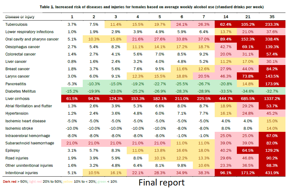
    Consider this table from the CCSA 2023 guidance document:

    As you will notice, there is data suggesting that one drink a week increases (or decreases) your risk of different dire “consequences” (their word). If you wonder how this one drink per week information is derived, you’re not alone.

    Basically, this is about mathematical interpolation. This involves making several assumptions about the risk data they have and drawing conclusions about the shape of the rest of the data based on those assumptions.

    So what is going on is a series of assumptions about the effect of the “dose” of alcohol on the body.

    To be clear, these are not assumptions without precedent. But they are assumptions that lead us in a certain direction, and the fact that they are assumptions is rarely ever stated.

    One thing that is clear is that the data assumes some kind of consistently sloped dose-response relationship (ie: the risk increases consistently as you consume more).

    “Dose response” is a concept that comes from pharmacology. Think of drug trials: If you have one Aspirin, you have a certain response, if you have two the body responds differently. If you have ten, you have a problem. (this is why we are advised not to drink while taking things like ibuprofen, since it taxes the liver and at a certain dosage it really effs up the liver).

    It is useful when assessing the effect of medicines on the body. Note also that dose response is not always linear: there could be a gradual increase, or a threshold after which the effect is more pronounced. Your liver isn’t effed up by iburprofen until it is.

    What is different with alcohol is that it is a natural product that the body has evolved to metabolize. A healthy liver is adept at processing alcohol in low amounts, and eventually will clear it all out.

    So data indicating increased risk from low amounts is difficult to justify biologically. Simply put, if you have one drink, your body will probably be able to deal with it easily.

    But that depends on what you drink and how you drink it. If you chug a beer or do shots of whisky (or even whiskey), the impact on your body is different than sipping any of these things.

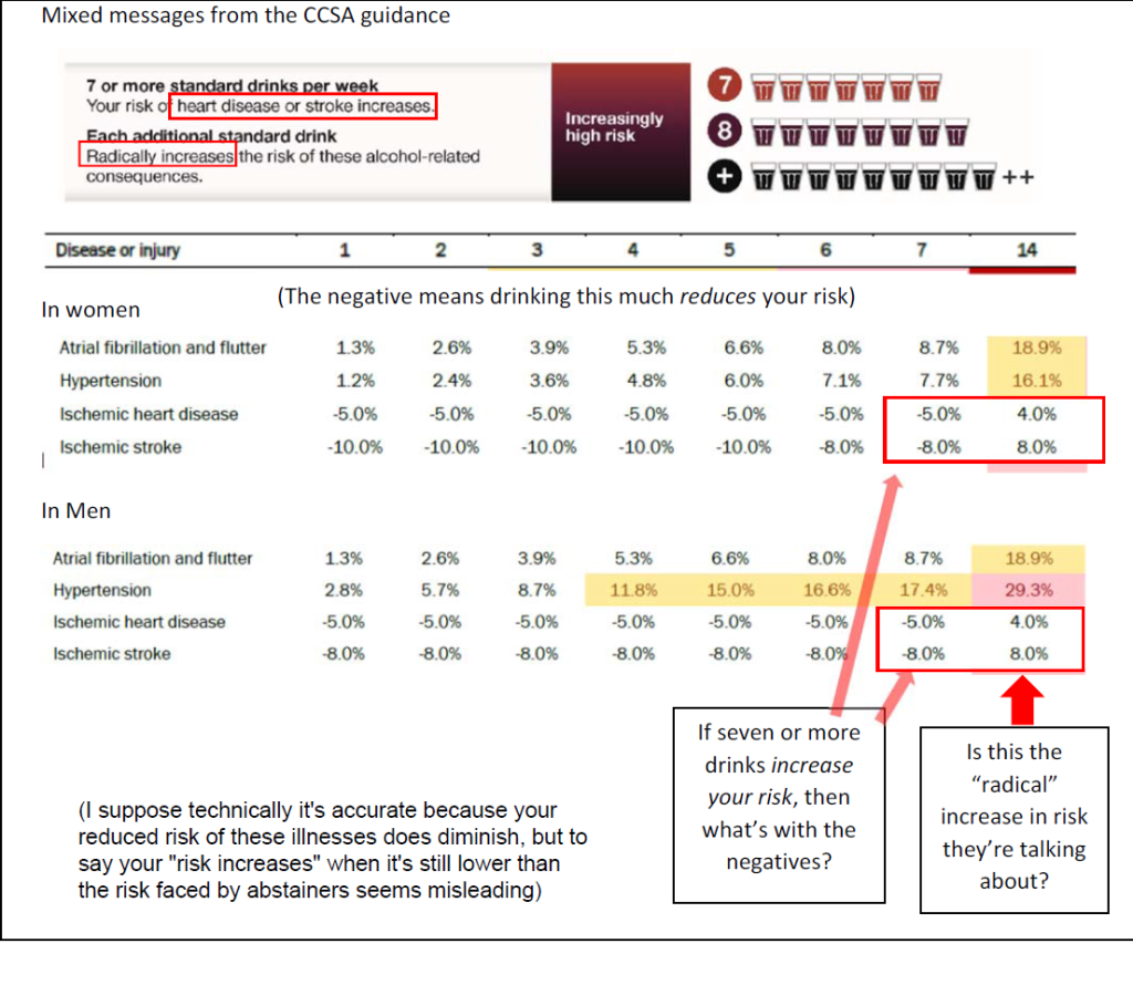
    To see the slope relatively easily let’s look at “atrial fibrillation and flutter” as an example. The numbers increase somewhat consistently from 1-7 drinks. 1.3% (+1.3) = 2.6% (+1.3) = 3.9% (+1.4)= 5.3% (+1.3) = 6.6% and so on I’m guessing the 1.4 is a factor from rounding. It only really takes off after seven drinks per week and that’s because the next number is 14 drinks, and 8.7 + (7 x 1.3=9.2) 17.9 a whole point below the 18.9% increase that is shown. So the slope gets slightly steeper but not really drastically so.

    Other cases have other unique characteristics. I’m not sure what is going on with the data on ischemic heart disease or stroke because the protective effects remain flat for the first five drinks, then go up but of course yet again we don’t have data for the 8-13 drink range. In their preliminary report (August 2022) the CCSA authors note that the low numbers for these conditions do not meet the “significant estimates” number so maybe the just guessed or something? See further discussion below.

    But we are talking about low amounts of alcohol consumption. It is really difficult to identify the actual outcomes of drinking for people who have had only one drink per week, because most people usually report less than they actually drink, and most people who drink probably have more than one drink a week. (note my guess here).

    We also know that most people who drink tend to drink moderately, so there is probably more data on those people in the 5-10 drink/week range than in the 1 drink per week range.

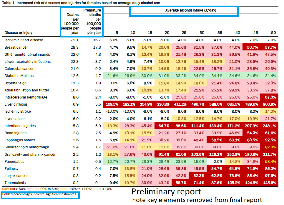
    This is probably easier to see in the preliminary data, which indicates also something they call “significant estimates” basically saying they have more confidence in the bolded data.

    In this table we see consumption of grams of alcohol per day. Normally you don’t think about grams of alcohol, so if you need to convert it. Consider in Canada a standard drink contains 13.45 g, but an easier way of thinking of this is a standard drink is 0.6 oz of alcohol. That’s the equivalent of 12 oz of 5% beer (12 x 0.05=0.6), 5 oz of 12% wine (5 x 0.12=0.6) or 1.5 oz of 40% spirits (1.5x 0.40=0.6).

    Here the increase is not hampered from absent data (the 8-13 drink / week gap). But it does show some weird outcomes in some cases, and which are not linear. I mean what is happening with intracerebral hemorrhage? Up to 20g/day (1.5 drinks or 10.5 drinks/week) the data shows reduced risk, then it leaps to 25% increased risk, but stays there up to 45g/day which is 3.3 drinks or a whopping 23.4 drinks per week. The data for diabetes is also interesting, rising up to about 3 drinks per day, then seeming to nearly flat-line.

    All this to say there is plenty of reason to be skeptical of the conclusions just from this data table. But why?

    To be perhaps overly simplifying it, constructing this type of data requires a number of specific decisions about how to proceed. For example, there are studies showing that drinking reduces the risk of certain cancers but they do not show up here; there was a decision to exclude that data probably based upon interpretation of the validity of the research. The decision to include estimates of one drink per day is, as I noted above, notwithstanding the fact that certain ways of drinking are less problematic and the data has to be interpolated.

    There is a ton of what I would call culture scrubbing in this research: removing the way people drink (time, pace, volume, demographics, location) from the data.

    For example, according to this data, doing seven shots on a Friday night contains the same risk as having glass of wine with dinner each night. Nobody in their right mind would see that as equivalent, but this is how the data is presented (caveat: in earlier info graphics the CCSA authors do indicate that more than 4 drinks in one session is not healthy, but that is not something indicated in their colour-coded risk tables).

    So if someone asks you if that one drink a week will cause cancer, don’t laugh, but maybe try to explain that any such data is taken out of real world context. If you are drinking reasonably and moderately (like at a wine tasting where you’re sipping a few oz of wine at a go) you’ll be fine. It is probably riskier to drive (sober) to the winery before the wine tasting than it is to drink those samples.

    I’m not a physician, but even physicians rely upon other researchers to inform their clinical advice. Guess which researchers have their ear?

  • Making risk meaningful

    Part 1: The misrepresentation of individual risk

    In November 1986, public health officials met in Ottawa and developed the Ottawa Charter for Health Promotion. This shifted the priorities of public health to include the idea that public health should be informing citizens of risks in order to help them make informed decisions about their behaviour. It’s a great idea, and the foundation for a lot of very good work in public health.

    The problem is: how do you communicate risk? Everyone’s context is different. As I have noted in my post about Social Determinants of Health, context matters. So as a white, middle class, well educated, well paid, cisgendered man, my risk of harms from various dumb things I do is different than someone who does not live in that position of privilege.

    The alcohol researchers seem to think using population level data is appropriate. But is it? Population level data aggregates experiences across populations. It attempts to adjust for things like gender, socio-economic status, etc, but cannot catch everything.

    So in the end it distorts risk.

    Even if I share the same risk from drinking 7 drinks a week with someone from a much more precarious and insecure economic status, saying that 7 drinks a week increases my risk of colorectal cancer by 9.2% does not consider things like whether I eat red meat or lots of fruit and veggies, how active I am, and so on. (If I were a woman I’d make a statement about how breast cancer’s causes are even more diverse).

    Major proclamations about the risk of drinking such as those released in 2022-23 by the Canadian Centre on Substance Use and Addiction (CCSA) — which mislabeled their advice as “Canada’s guidance” (“Canada” has not made this guidance) and has disseminated its findings around the world — use something called Years of Life Lost data (YLL). This is problematic.

    I showed the YLL data tables from the 2023 “Guidance” to an epidemiologist colleague who did a double take. “That’s not how we use YLL data,” he said.

    YLL data is a measure of global disease burden. It helps governments and public health agencies prioritize interventions that thus help address premature death. It is not a measure of individual risk.

    What the CCSA did was come up with some definition of how many lost YLLs would be considered reasonable and used that as their baseline for acceptable risk. I am not going to get into the specifics partly for fear of being accused of misrepresenting it and partly becasse it does not matter.

    The point is that YLL is meaningless for individual health decisions. Meaningless.

    So how do we gauge risk? And how can the vast research that says alcohol is bad for you be translated into meaningful health information? There are ways, but let’s first consider the core dilemma: health is about balance, making decisions in life requires assessing risk and benefits. And understanding risk requires a sense of proportion that is often missing from alcohol research.

    Saying alcohol increases your risk of cancer or other diseases is also meaningless, at least without some important context. Walking outside increases my risk of skin cancer. But the increased risk is marginal. Moreover, walking is a good form of cardiovascular activity, so it balances the risk of skin cancer against the benefits of walking.

    Alcohol research these days, even when it uses language like the “risks and benefits of drinking” usually jettisons any sense of proportional benefit. Instead of talking about things like the benefit of socialization, the relaxing effect of having a drink with friends (or heaven forbid alone), the sheer pleasure of a wine tasting event or a food and beer pairing session, or the creativity that can emerge from a few drinks while mulling over a problem, they reduce all drinking to a biological process that ignores such context.

    And what is worse, they call those sorts of events “normalization” of alcohol, spitting out the term as if there is some conspiracy to make alcohol a normal part of our lives (it is a normal part of most people’s lives, and I would argue that pushing people to stop drinking is what is abnormal… But I digress).

    As a result we have no really useful ways to assess any risks associated with drinking, and we have a distorted impression of what drinking does to and for us.

    Now, as I said earlier, there are other ways of making risks meaningful for individuals. The CCSA’s preliminary report gave a bit of this information (it put annual death rates beside each disease or injury in its risk tables) but it removed it for the final report. Yet even such data can distort, because it also misses the complexity of our context.

    I will talk about some of these other ways of assessing risk in a future post.

    For now just keep in mind that all this hyped up alcohol risk data is at least disconnected from actual life. At worst, it is complete misdirection designed to strike terror in the hearts of moderate drinkers.

    By the way, fear and anxiety are also risky.

  • How culture scrubbing denies context and reinforces dumb stereotypes

    If you remove something as complex as consuming alcoholic beverages from its cultural context, the knock-on effects are remarkable.

    Consider the fact, recognized broadly even by some of the most ardent advocates of the population health epidemiological approach to distorting health effects of drink, that people of higher incomes tend to have better health outcomes in general than those of lower socio-economic status (SES).

    This relates to something we call the Social Determinants of Health (SDH). These are a variety of factors that affect our health, but are not directly related to biology: income level, housing quality, employment opportunities, access to decent food, social services, etc.

    These things all affect our health but they are normally out of our control. Someone who has a low income can’t just magically get a great job. Someone with limited education can’t just magically have a better education (especially if they’re working 60 hours a week just to get by). And on it goes.

    This has been widely recognized by health bodies around the world. It has also led to some remarkable progressive efforts to equalize the conditions that can be addressed, such as eliminating “food deserts” in cities and advocating for food programs in schools, improved social housing, etc.

    Now when you strip away considerations of social class, economics, and so on from things like the health outcomes of drinking, you get a highly distorted picture (and I’d argue a mostly theoretical picture) of the impact of drinking on health. All of those social determinants of health are ignored or at least seriously marginalized while theoretical models of health outcomes based upon theoretical individuals who theoretically all all in the same context.

    So for example, a poor person and a rich person could drink the exact same quantity in the same patterns, and their health outcomes could be different because of those broad SDH factors and many of these cannot be managed (or “controlled”) statistically.

    Even if you could control for every cultural factor that goes into an individual individuals risk for certain harms related to alcohol, even if the relative risk increases at the same rate, the overall risk (we usually call this “absolute risk”) of them developing certain conditions or falling victim to certain unfortunate outcomes related to alcohol is significantly different. It is not, however, captured in most of the alcohol harm research and such complexity is hardly ever included in public health anti-alcohol messaging.

    Alcohol researchers recognize cultural context, but do their best to eliminate it. For example, when Zhao et al published their article claiming to have proven there is no benefit to moderate drinking, they did it by eliminating any data about abstainers because abstainers are a complicated bunch. Some of them are lifetime abstainers, some stop because they are sick, some claim to abstain but do not.

    So instead of digging into these complications, they eliminated them. They decided that people who claim to drink very little (itself a cultural factor) could be a “proxy” for abstainers (even though they do not abstain) and then ran their numbers until they had results that showed no statistically significant effect of moderate drinking compared to this group of [non-]abstainers. Cultural considerations were intentionally erased to get cleaner (and for anti alcohol researchers, more satisfying) results.

    Along with being just another way context is dismissed, what does this type of culture scrubbing do?

    I would argue that by dismissing Social Determinants of Health, culture scrubbing opens a door for a much more virulent form of paternalism: arguments about Commercial Determinants of Health

    See, marginalizing SDH, which are something on which I’d argue governments should (and could) act to allow people to live in a reasonable level of healthfulness, opens the door for arguments about the “Commercial Determinants of Health” to take hold. This idea that people are surrounded by commercial forces that undermine the individual’s ability to be healthy is appealing to governments and progressive public health advocates.

    We see such arguments in statements about advertisements for sugary drinks and ultra processed food, all of which rest on an assumption– or even an assertion — that the industry behind this is determined to ruin people’s health, or at least is not bothered about issues of health. This then leads to arguments that, with such predatory bad actors out there, governments need to crack down on all these things that hurt people’s health. (Ban advertising, label everything that even seems unhealthy, and so on)

    I’m no supporter of the big food industry–I prefer locally sourced, home made, and so on, and to be clear I have the income that allows me the luxury of acting on that preference–but I do see such arguments as problematic for a few reasons.

    1. They are deeply paternalistic: they do not accept that people make their decisions for purchasing food for all sorts of reasons, and many of them are entirely reasonable based upon the context (for example, fast food is quick and easy for parents who are rushing from one job to another to make ends meet; some people simply enjoy it). This is called “agency” and CDH arguments generally deny it to the “victims” of CDH.
    2. They distract from the Social Determinants of Health: maybe people would make healthier choices if they had the time, money, and access to better food, and if they didn’t have to work 60 hours a week to make ends meet.
    3. They reiterate a classic narrative of some predatory outsider going after unwitting innocents for personal gain. Although this is not entirely fictitious (if you think capitalism and profit are toxic predatory factors, then it’s entirely reasonable to think all these bad actors are just in it to profit on the misery of others).

    The Commercial Determinants of Health are peak paternalism. They deny agency of these poor victims who would never go for fast food or a cola if they were not forced to do so by the predatory corporations. They allow these public health researchers to position themselves as heroes protecting the victims, while allowing governments to ignore the very considerable social factors that put many people in this vulnerable state.

    (Ironically, some researchers squeeze millions of dollars out of governments to pursue their CDH agenda. I wonder what those millions could have done if redirected to healthy food programs, education, or housing.)

    Just to be clear, I am not denying that companies and industry lobby governments to get preferential treatment. But that is very different than what CDH arguments advance as the insidious effect of commerce on individual health.

    What does this have to do with drink? Well quite a bit actually. If you remove social context, generate data that does not consider cultural factors, and make big dumb statements about how the industry is out to kill everyone, then you’ve ceased to be a reasonable scholar or a reasonable health advocate, and you’ve become a zealot.

    And yet… these arguments are the ones we hear. Partly this is because if an industry group says it, then it is framed as just self-interested, but if public health or health researchers say it, it is framed as disinterested public service. Notwithstanding the millions of dollars of funding that flows into this research.

    This leads us to one final issue: the unbalanced research environment. People who seek to undertake more balanced research, and those who may find benefits in things like moderate drinking, have far fewer funding opportunities, and may risk becoming labelled as “industry apologists.” They may be (and some have been) black listed within the health research community.

    This is a silencing that is skewing research and distorting our understanding of the health effect of drinking.

    Silencing voices leads to ignorance not enlightenment.

    While culture scrubbing limits the ability to discuss the complexity of everyday life and behaviour.

  • Culture scrubbing. What are population level alcohol studies doing to real life?

    Data scientists often engage in a process called data scrubbing, or ” cleaning” the data. It’s not nefarious, it is just the way to ensure that the data they are using is the most reliable and analyzable data available. Although the decisions on data scrubbing are based upon researchers’ ideas of what kind of data is most reliable, it is necessary for coherent analysis.

    Data scrubbing involves removing unreliable or complicating data.

    One other thing that happens, especially in population level alcohol studies using epidemiological data is something I call culture scrubbing. The process of lifting the activity of drinking from its actual cultural context.

    Culture scrubbing is normally unintentional, but extremely important and prevalent in alcohol studies. It allows certain types of drinking to be compared, but also allows broader datasets to be analyzed. According to alcohol researchers, it is necessary for clean and reliable conclusions. To those of us who study drinking, not just drink, it renders much of those conclusions meaningless, or at least highly suspect.

    To illustrate this, here are some simple questions. When you go for a drink, do you count the grams of alcohol in your beverage? No? Ok, well do you count your drinks per week or drinks per day? Do you drink regularly the same amount each week, or are there times of the year when you might drink more or less? Do you consume different types of alcoholic drinks at different times of the year, or week?

    These are all examples of cultural idiosyncrasies of drinking that disappear in much alcohol research. And they are really important. not just because some grouchy contrarian like me will say “but you’re lifting drinking from lived experience” (which I say a lot and yes I am grouchy) but because, if the point is to give meaningful advice about an individual’s drinking, you need to recognize that different people drink differently at different times and in different places.

    So alcohol research does a few key things to culture scrub:

    • Calculates alcohol as grams of ethanol rather than drinks
    • Eliminates considerations of different types of beverage(wine, beer, spirits) arguing that it’s all ethanol anyway and if we asked people, say, about the amount of wine they drank, that might not capture the other substances so the data will be meaningless
    • Talk about drinking patterns as some kind of regular behaviour: drinks per day, drinks per week, not recognizing that people drink differently across the seasons
    • Reduce or eliminate discussion of age or any other demographics except for biological sex
    • Do not consider location where people are drinking
    • Do not consider why people might drink, or other patterns rooted in culture.

    Let’s take an example. When I was in my early 20s, I could really put it away. And sometimes I did. And then sometimes I did not.

    Sometimes it was a bunch of beer on Friday. One time I went head to head with a bottle of tequila and a woman who was smaller than me, but kicked my ass metaphorically despite the lower body mass. (She was from the Canadian maritime provinces, which may explain a lot).

    If I ever tried to drink in one session now (at 58) the amount I did when I was 25, I’d at best just pass out, but definitely make a call on the porcelain telephone.

    So age matters.

    Then there are patterns of the year. At holidays people might drink more, and different seasons are conducive to different drinking patterns and different types of drinks. Long slow drinking bouts on a patio may mean vastly exceeding recommended limits, but the slow part is important: your liver is doing the work it’s evolved to do. A Friday night session with work colleagues (the ones you like, not with that guy–you know who I’m talking about) may involve different types of drinking–a round of shots? Maybe (even at 58).

    My local brewpub used to gift me a shot of bourbon on my birthday. I think it was an excuse for the bartender to join me in a shot…Ah the good old days.

    My point is this: consuming alcohol is deeply embedded in our culture. And the process of lifting it out of cultural uniqueness, under the excuse of more adequately analyzable data, actually undermines the entire process of providing meaningful advice to people.

    At the least the advice will be misunderstood, at the worst such advice will be dismissed as more paternalistic finger wagging. Neither is ideal.

    It is time to bring culture back into the discussion.

  • Anti-alcohol advocacy narrative.

    Aka: The horror. The horror

    *Originally posted on Linked in May 2026*

    I’ve been thinking a lot about the dominant narratives coming out of alcohol research that uses population-level data and the advocates who amplify it.

    A subtle but dominant undercurrent reiterates a link between pleasure and risk. This has deep cultural manifestations:

    -Hansel and Gretel were tempted by the tasty looking gingerbread house,
    -Sailors were lured to destruction by the beautiful siren song.
    -King Midas’s desire for gold left him unable to eat.

    Debates about alcohol today are imbued with this same suspicion of pleasure: it should be scrutinized, disciplined, and if not eliminated, at least severely reduced.

    Self-restraint meanwhile is a moral good.

    It reminds me of classical asceticism, where the denial of bodily pleasure was tied to the hope for salvation.

    Today the concern is no longer about preparing for “the next life” but ironically, about extending this one as long as possible.

    That in itself would not be worth commenting upon, except that asceticism, then as now, was founded on an evaluation of the body’s moral weakness.

    In short: health has become a new morality. And as with any moral cosmology, it is a basis for judgement.

    Since many things that bring bodily pleasure are risky, a good (aka responsible) person is expected to avoid them.

    Consequently, the amount one drinks (or whether one drinks at all) can be a way to assess an individual’s character.

    Research exploring alcohol’s harm appears to provide helpful guidance through this wilderness of temptation.

    While those who criticize the new morality are apostates, to be shunned or ignored.

  • Accepted narratives drive analytical choices

    *Originally posted to LinkedIn May 2026*

    In a recent JAMA Network article reassessing evidence of alcohol harm over time, the authors concluded that there was no significant benefit to moderate drinking; they effectively eliminated the J-curve. One reason the J-curve disappears is that the researchers treated self-reported abstainers as unreliable and removed them from the dataset. They used those who reported very low levels of consumption as a proxy for abstainers.

    That seems like a reasonable adjustment. But if the issue is the health impact of abstinence versus moderate drinking, removing abstainers from the analysis effectively undermines the purpose of the study.

    It does, however, support the narrative.

    The study was published in a highly respected journal and widely circulated (at times triumphally) as evidence that alcohol has no positive health value.

    This illustrates the power of narrative in steering research. When certain elements are accepted–for example, that alcohol is harmful–the analysis can begin to move in that direction. Adjusting the analysis to address results that do not fit expectations (often referred to as “torturing the data”) begin to seem reasonable.

    The result is often a set of findings that appear more consistent and more certain than the underlying data would suggest. It creates the impression of consensus in a field where there are, in fact, many complicating variables.

    But it tells a clear story.

    At that point, it becomes harder to tell where the evidence ends and the interpretation begins. The story doesn’t just emerge from the data; it starts to organize it.

    The challenge is not just evaluating the evidence, but understanding how it is being shaped.

  • Never let the data get in the way of a good story.

    *Originally posted to LinkedIn April 2026*

    As a historian, it’s my job to think about what story the evidence tells us: who is doing what, and why. I approach current alcohol research in much the same way.

    Consider, for example, the CCSA’s low risk alcohol guidance. We see a narrative designed to lead readers in a specific direction. It’s a familiar structure:

    –Alcohol (and by extension the alcohol industry) is the villain, the agent of harm.
    –People who drink are the unwitting victims.
    –Researchers, working with population-level datasets and increasingly sophisticated analytical tools, identify the problem.

    From here the story can move in several directions:
    –Policymakers, now equipped with this evidence, are expected to address the threat.
    –Drinkers, now informed by science, are expected to change their behaviour.

    (Often, both are expected)

    This format can affect the type of evidence presented and highlighted. Decisions about which effects to emphasize (such as mildly increased risk of cancer versus decreased risk of heart disease), how to group categories, or how to illustrate results aren’t just technical decisions: they help hold the story together.

    When this is combined with a narrowed field of vision—where certain kinds of evidence or perspectives are set aside—the story begins to move in a particular direction.

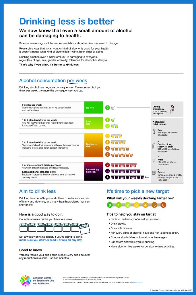
    This may be illustrated by the difference between the risk table in the CCSA’s preliminary report (Aug 2022) and the final guidance (Jan 2023). (I’ve attached examples below and the colour coding itself is telling.)

    We are no longer just looking at data. We are looking at data being organized into a particular kind of narrative that points toward a single, consistent conclusion.

    I have highlighted the way the data presentation has changed. The death rates have disappeared, which were really the only way a reader could get a sense of absolute risk. The alcohol intake data has changed (in the preliminary report it was grams per day, but the final report was drinks per week–which is better since peple tend not to think of drinking in terms of grams of alcohol).

    The little notation that bolded data indicates “significant estimates” is now gone. That change may be useful because what does “significant estimate” mean, Does “significant” mean “major” or “big” or does it mean statistically significant–the latter actually. Also what does “estimate” mean in terms of how that informs the final guidance.

    Also notable is that the final data table indicates drinks up to 7 drinks per week then jumps to 14. It does not show 8-13 drinks even though the advice does specifically talk about what happens at 7 drinks or more. See the final two images.

  • Temperance redux

    Why can’t they just leave us alone?

    *Originally posted on LinkedIn April 2026*

    Over the past few years I’ve spent a lot of time thinking about alcohol research that emphasizes harms and minimizes benefits. The more I read, the more familiar it began to feel.

    As a historian, I realized I was reading a repackaging of the Victorian temperance movement.

    It took a while to realize what that meant. At first I engaged with the research in the way it is intended: looking at data, assessing methods, and challenging the arguments on their terms.

    But in my field, we think in terms of context; we attempt to reconstruct and understand what was happening in the past. And we look at the activities of all involved in generating new knowledge. To do that we pay attention to narrative. We ask: what’s the story?

    It occurred to me that much alcohol research is advancing a narrative which is clever and subtle, but also misleading in notable ways.

    Consider the consistent talking points and arguments emerging from some major players. We see them in the US Surgeon General’s advisory on cancer labels on booze; the Canadian Centre on Substance Use and Addiction (CCSA’s) 2023 “Low risk drinking guidance”; and releases from the WHO.

    They present clear, uncomplicated statements about alcohol harm, using language that lacks nuance: “no safe level,” “even moderate drinking is harmful” and (my least favourite) “harmful from the first drop.”

    Drawing upon a vast body of complex and diverse research, there is the same clarity. Moral clarity.

    That’s not typically how scientific investigation operates. It’s messier. Science is about investigation, disagreement, and debate. Researchers build on and challenge each other’s work, tweak methods, re-run experiments, generate new data, challenge existing paradigms, revise theories… It is dynamic, organic, complex and rarely lands at the same conclusions.

    (This is, to be clear, the nature of all scholarship, which frustrates some people who look for easy answers).

    So along with examining the challenges of the data, we need to think about the way that this evidence is being presented.

    So: what’s the story here? I have thoughts (see my next posts)